At Mixmax, our job is to give our users half of their day back. We want to empower people to focus on the real interpersonal work of communication by designing, automating, and integrating away “toil”, i.e. mindless drudgery. We don’t want our users to spend their lives:
- Scheduling meetings via sixty-two back-and-forth emails
- Updating the status of every contact and lead in Salesforce by hand
- Copy-pasting the same content into every recruiting message
So we built a product that makes all of that stuff “just work”, and lets users focus on the parts of their jobs that they actually have to think about.
But for engineers on the Mixmax team, the responsibility to respect our users’ time extends beyond adding cool features and into our implementation decisions. Even more than most companies, we have an obligation not to make users wait for our product to load, process, or respond. With that in mind, here are five best practices for building snappy, respectful web applications.
Optimistic rendering
Optimistic rendering is the design pattern of behaving as though an action were successful before that action has actually been completed. In web apps, this most commonly means updating a view based on the assumption that an issued network request will return 200 OK. For example, when a user creates a sequence, template, or rule in Mixmax, we instantiate a client-side model representing the asset and render the editing UI before making a single request to our servers, based on the assumption that the POST request to create the model will succeed.
Why render optimistically? Optimistic rendering is the only way to divorce your web application’s performance from network conditions. In a local development environment, when your server-side code is running on your own machine, it’s easy to forget how waiting for a network request can induce sluggishness. Users in Australia are not likely to be so forgiving.
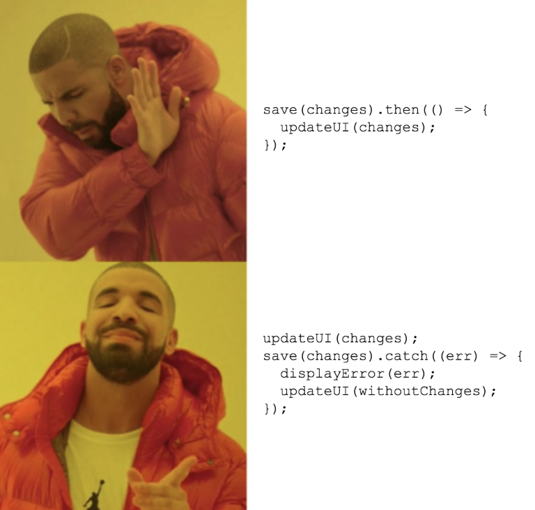
At Mixmax, we’re a glass half full kind of engineering team -- we’ve solved many a latency issue by simply being optimistic about requests, instead of blocking rendering or navigation. That said, as the old Russian proverb goes: “trust, but verify”. It’s important when rendering optimistically to handle the failure case, updating your UI to match reality when something goes wrong. Luckily, promises provide a natural affordance for this: the catch() handler.
To put it in a meme:

A lot of folks are wary about optimistic rendering because failure cases can be difficult to handle (e.g. if the user has made edits since asset creation failed, or closed their browser assuming success). We’d argue that it’s unwise to generalize practices based on such edge cases. What is the failure rate of a given action? How much better is the UX in the success case if you render optimistically? When you consider these tradeoffs carefully, you’ll often discover that a slightly surprising experience for .01% of requests is worth instantaneous UI response in the 99.99% case.
Judicious use of loading spinners
Of course, you can’t always render optimistically. Consider what happens when you have to load data for a dashboard, or search for a record in Elasticsearch. In such cases, the client can’t render content before it actually gets the underlying data! (More generally, a loading state is almost always necessary for GET requests, but avoidable for POSTs, PUTs, or DELETEs.)

When you need data before you can render, showing a loading spinner is better than not showing anything at all. The overriding principle here is that your UX should always immediately respond to user input in some way. When a user clicks a Mixmax meeting template, they don’t expect to have to wait a second before anything happens -- so we show a loading spinner until their data is ready to render.
If you want to get really cute, you can do better than a literal loading spinner. Sometimes it makes sense to bootstrap data for detail views in the first GET request for a page, even if that data isn’t visible in the page’s default state. We do this in our Tasks dashboard to load task details faster, trading off a bit of loading time on initial page render for instant opening of every task’s edit view. You can also go in the other direction and load no data on the initial render. Companies with lots of resources, like Slack and Facebook, render “fake UX” while loading data, simulating the shapes and colors that their content would fill. This can be costly in terms of designers’ time, but rendering these templates server-side and sending them to users before doing anything slow (like fetching from a database) can really increase users’ perception of your app’s speed.
Of course, even with the slickest loading state in the universe, your users will notice if that first render takes ten seconds to pop in. In fact, 53% of mobile users will abandon your page if it takes more than three seconds to load! This is where backend performance comes in. At Mixmax, we measure latency on all of our API endpoints. If the p90 latency on an endpoint breaches a set threshold, our alerting system automatically files a JIRA ticket to improve the performance of that endpoint. This is also a great way to motivate yourself to clear out tech debt!
Simulating bad network conditions
One of the most important skills of a product manager or designer is to have empathy for the user. Many companies, understanding this, encourage employees to “dogfood” their product by using it in their own day to day operations.
Dogfooding done well helps to identify high-value, low-cost bugfixes and features. But much dogfooding is not done well, and instead serves to build a false sense of security. The crux of the problem: just using your product isn’t enough to accurately simulate the user experience! To identify and prioritize issues, you must simulate your user’s actual operating conditions.
Do you have a brand new laptop and high-speed office internet? Your users don’t. Maybe you use your own product every day, but have you tried using it…
- On an airplane?
- On a phone?
- On a five-year-old laptop?
If not, you’re probably deluding yourself, as far as your app’s actual performance goes.
At Mixmax, before we release any feature, we test it in Slow 3G with throttled CPU. In this, as in many other things, the Chrome dev tools are your friend:

Predictable interfaces
OK, so your app is fast. You optimistically render where you can, show loading states quickly where you can’t, and do this all in bad network conditions on old machines. Awesome! But be careful -- all of the goodwill that this speed has earned you can be lost if you’ve sacrificed UI predictability in the name of speed.
In UI design, though in no other respects, we at Mixmax strive to emulate the Weeping Angels, a recurring villain from recent seasons of Doctor Who. The Weeping Angels are a species of alien assassins that (as an evolved defense mechanism) turn to stone when they’re observed.

Like a Weeping Angel, when your UI is being interacted with, it should not suddenly attack the user! We’ve all used UIs that get this wrong:
- The Java updater that interrupts whatever you’re doing to ask you to approve a download
- That one pop-up ad that says you’ve won a new iPhone
- Those social icons on your phone that pop a new row of contacts in under your thumb right before that thumb hits the screen to share a photo with your significant other. every single time
If you have an alert to display, display it in direct response to a user action. If you’re optimistically rendering, and the user has moved on to some other action, try not to pop up a “save failed” notification while the user is editing some unrelated text field! Challenge yourself to find a way to show failure without focusing an element in the DOM, e.g. by adding some notification text to the page instead of popping up an alert. Your goal is to avoid disrupting the user’s flow state, and to behave in ways that they expect.
Semantically correct behavior
No list of best practices would be complete without a mention of HTML and HTTP semantics. For instance, what does your API return in response to PATCH requests? Technically it’s not in the RFC, but some frontend model layers (ahem, Backbone) are quite insistent that APIs should only return modified fields, and do bad things when you break this expectation (like resetting any changes that the user made while the request was in-flight!) In order to get autosaving Backbone models right at Mixmax, we had to be careful to abort any in-flight HTTP requests before making new ones.
And of course, there’s accessibility to think about! This topic deserves its own whole book, but: have you tried using your app with a screen reader recently? Do your images have alt tags? This is one area of our product at Mixmax that we can definitely improve upon -- certain user interfaces, like flyouts that open when hovered, can be very difficult to use for those of us who don’t interact with the web visually.
As a general principle, remember that best practices are usually best practices for a reason -- and even if they aren’t, libraries and tools will often assume that they are, and cause you all kinds of trouble if you don’t follow them. So save yourself the headache and stay compliant!
Conclusion
We all only have so much time in this world. Who wants to spend theirs waiting for an email to send? Or reading the padded-out conclusion of a blog post?
Interested in building lightning-fast interfaces? Join us at Mixmax; we’re hiring!


